In today’s rapidly changing terrain of graphic design, staying acquainted with the latest trends is not just advisable; it’s essential for maintaining relevance and competitiveness in the field. Trends come and go, but understanding their significance and learning how to integrate them into your work seamlessly can significantly enhance your designs. In this article, we look at the key trends shaping the graphic design scene in 2024 that you should try out. Furthermore, we explore practical strategies for incorporating them into your projects.
Trend #1: Sustainability
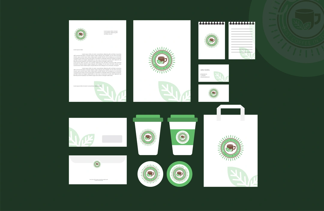
Sustainability has emerged as a defining trend in the world of graphic design, reflecting a broader societal shift toward environmental consciousness. Brands like Apple Inc., Microsoft, and Patagonia are increasingly recognising the importance of adopting eco-friendly practices, and consumers are placing greater value on products and services that prioritise sustainability.
As a graphic designer, embracing sustainability in your designs can not only align your work with ethical principles but also appeal to a growing segment of environmentally conscious consumers. Consider incorporating eco-friendly materials, such as recycled paper or biodegradable packaging, into your designs. Explore printing techniques that minimise waste and reduce environmental impact, such as soy-based inks or digital printing technologies.
Moreover, be mindful of the colour palettes you use in your designs. Earthy tones and natural hues not only evoke a sense of sustainability but also resonate with eco-conscious consumers. Minimalism, with its emphasis on simplicity and efficiency, is often associated with sustainability and can serve as a guiding principle in your design approach.

Trend #2: Maximalism
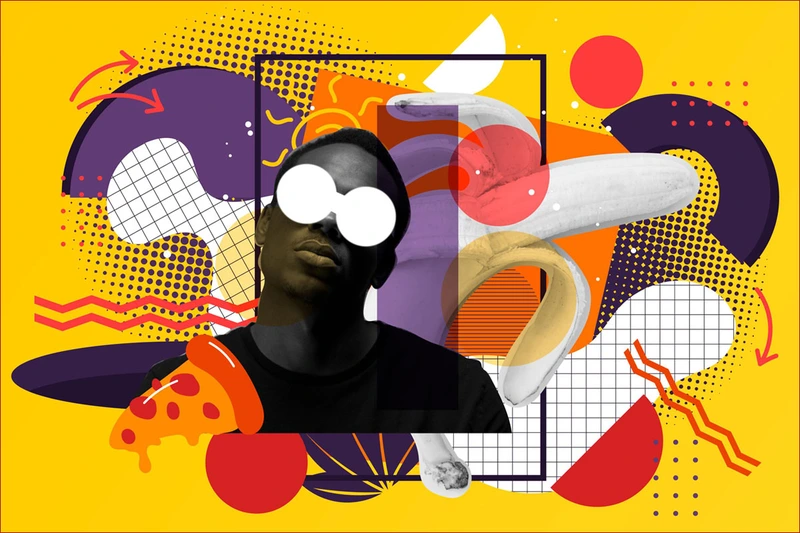
While minimalism has long been a dominant trend in graphic design, there’s a growing appetite for maximalist aesthetics in 2024. Maximalism celebrates boldness, complexity, and intriguing visual presentations. At first glance, it may seem chaotic, but upon closer examination, a deliberate structure emerges.
Incorporating maximalist elements into your designs requires careful consideration and strategic planning. Start by defining a clear concept or theme that ties all the elements together, ensuring cohesion amidst the visual complexity. Experiment with vibrant colours, intricate patterns, and detailed illustrations to create visually arresting compositions that command attention.
Maximalism is particularly effective at engaging niche audiences who appreciate intricate and immersive design experiences. Whether you’re designing for fashion brands, music festivals, or cultural events, embracing maximalism can help your work stand out in a crowded marketplace and leave a lasting impression on viewers.
Related Stories: What Is Google Bard AI? Features, Capabilities, and How to Use It
Related Stories: The Fabelmans (2022) Movie Review: Jewish Boy Obsessed with Filmmaking

#Trend #3: Dynamic Typography
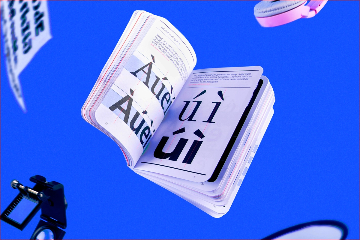
Are you tired of static typography? If the answer is yes, then you’re not alone. The world is changing, and so is typography, which plays a crucial role in graphic design, conveying not just information but also mood, tone, and personality. In 2024, dynamic typography has emerged as a key trend, offering designers new opportunities to experiment with movement, interactivity, and expression.
Dynamic typography goes beyond static text by incorporating animated elements, transitions, and effects that capture the viewer’s attention and enhance engagement. Whether you’re designing for websites, mobile apps, or social media platforms, dynamic typography can inject vitality and dynamism into your designs, making them more compelling and memorable.
Explore techniques such as kinetic typography, which uses motion to bring words and phrases to life, or interactive typography, which allows users to interact with text in meaningful ways. By embracing dynamic typography, you can create immersive design experiences that resonate with your audience and elevate your work to new heights.
Related Stories: Indian CEOs are Shaping the Future of Global Business
Related Stories: 10 Fun Facts About Apple Google Samsung & Microsoft You Didn’t Know
Trend #4: Nostalgia
Despite its regular appearance, this trend continues to attract audiences and inspire designers to push the boundaries of their craft. It reminds us that while trends may come and go, the spirit of innovation and experimentation remains constant in the world of design. Drawing inspiration from the past, whether it’s the vibrant hues of the ’80s or the retro typography of the ’70s, adds a nostalgic charm to designs that resonates with viewers on a deep emotional level.
Incorporating nostalgic elements into your designs requires a subtle understanding of cultural references, historical contexts, and personal experiences. Research iconic design styles, trends, and motifs from different eras, and find creative ways to reinterpret them in a contemporary context.
Retro colour palettes, vintage typography, and classic design elements can evoke a sense of nostalgia while maintaining relevance and modernity. Whether you’re designing for branding campaigns, packaging, or digital platforms, nostalgia can add a nostalgic touch that captivates viewers and creates a sense of connection and familiarity.

Related Stories: Russia Fines Google $20 Decillion Over YouTube Bans – Is That Even Real?
Related Stories: The Father (2020) Movie Review – Inside the Mind of a Dementia Patient with Anthony Hopkins
Now the question remains, how would I personally use these trends?
Integrating Trends into Your Work
As a graphic designer, knowing how to integrate trends into your work effectively requires a blend of creativity, strategy, and practicality. It’s not just about following the latest fads; it’s about understanding the needs and preferences of your audience and finding innovative ways to meet them.
Start by analysing the objectives of your project and identifying the target audience you’re designing for. Consider their demographics, psychographics, and cultural influences, and tailor your design approach accordingly. If you’re designing for a young, tech-savvy audience, dynamic typography and maximalist aesthetics may be particularly appealing. On the other hand, if you’re targeting an older, more traditional demographic, a minimalist approach with nostalgic elements may be more appropriate.
“Imagine I’m designing a website for a sustainable clothing brand. Earthy tones and natural textures from the sustainability trend would be ideal for the color palette. Dynamic typography could be used to showcase product features in a captivating way. Finally, a touch of nostalgia could be incorporated through vintage-inspired fonts for the brand name and tagline. Crazy, yeah?”
Remember that trends are just one aspect of design and should be used prudently to enhance, rather than detract from, the overall user experience. Experiment with different techniques, styles, and approaches, and don’t be afraid to push the boundaries of conventional design norms. By staying curious, adaptable, and open-minded, you can create designs that not only reflect the latest trends but also resonate with your audience on a deeper level.
In conclusion, trends in graphic design are constantly evolving, reflecting shifts in technology, culture, and society. By staying informed, embracing innovation, and honing your design skills, you can stay ahead of the curve and create designs that are not just trendy but timeless.