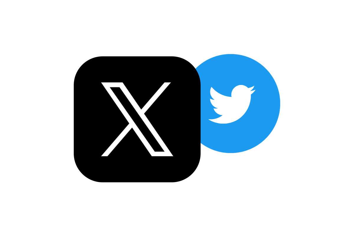
Twitter users expressed mixed reactions on Tuesday after Elon Musk and Twitter CEO, Linda Yaccarino, unveiled a new logo for the social media platform, replacing the iconic blue bird with a simple “X,” as part of Musk’s pursuit of rebranding Twitter to X (X.com)
Some users praised the new logo, calling it “modern” and “minimalistic.” Others were more critical, saying that it was “bland” and “uninspired” in comparison to the famous blue bird that’s been Twitter’s logo since 2012.
Among the people who felt the loss is Martin Grasser, the designer of the Twitter bluebird. In his tweet, he said, “Today we say goodbye to this great blue bird. This logo was designed in 2012 by a team of three @toddwaterbury, @angyche and myself. The logo was designed to be simple, balanced, and legible at very small sizes, almost like a lowercase ‘e’”
Another user said, “I miss the old logo. The bird was so iconic.”
Musk himself defended the Twitter blue bird to “X” rebrand, saying that it was “To embody the imperfections in us all that make us unique” explaining the symbolism behind the logo as he believes it’s unique, simple, and timeless.
It remains to be seen whether the new logo will be a hit with Twitter users. However, it is clear that the change has sparked a lot of discussion and debate.
- Here are some specific examples of reactions from Twitter users:
- “I love the new logo! It’s so modern and sleek.” (posted on July 25, 2023, at 10:00 AM)
- “The new logo is so boring. I miss the old bird.” (posted on July 25, 2023, at 11:00 AM)
- “The new logo is a step in the right direction. It’s more minimalist and less cluttered.” (posted on July 25, 2023, at 12:00 PM)
- “The new logo is a disaster. It’s so generic and forgettable.” (posted on July 25, 2023, at 1:00 PM)
What do you think of the new Twitter logo?
1 thought on “Twitter Users Express Mixed Reactions to Elon Musk’s “X” Logo”
Pingback: Elon Musk’s SpaceX to Launch Tesla’s Optimus Robot to Mars in 2026 - Nymy Net